Blogs/ Web UI/UX Designing

Mobile First Design Why It's Crucial for Your Business Website?

Esther Howard Esther Howard | February 11, 2026
UI/UX Designing Web Designing Mobile First Web Design Technology
Mobile First Design

What is a Mobile-First Design?

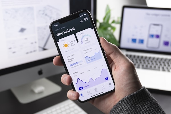
The first wave of mobile-first design appeared in 2010. It started when Google's CEO announced that all website development should be 'Mobile-first'. Now, what does it even mean? Mobile-First design is designing websites or apps to make them work well on mobile devices. You usually start with the design for a computer screen and then adapt it for mobile. But here, you start with mobile devices first.

This approach makes your design look great and function smoothly on smaller screens. It's all about putting mobile users' needs first to create a better experience.

What are the Phases of Mobile-First Design?

Mobile First Design Phases

The phases of mobile-first design ensure that a website or app works perfectly on mobile devices before adapting it for larger screens. Here's a simple breakdown of these phases.

01.Research and Planning

Understand what users need and how they interact with your mobile site or app. Start with what you want to achieve with your design. Improving user experience or increasing engagement?

02.Wireframing and Prototyping

Sketch basic layouts for mobile screens to outline the structure and elements. Develop interactive prototypes to test the flow and usability of the design on mobile devices.

03.Design and Development

Focus on creating a clean, user-friendly design that works well on small screens. Put important content and features first. Write code and build the website or app to function on mobile devices before adapting it for larger screens.

04.Testing and Optimization

Check how your design performs on different mobile devices to ensure it loads and works as intended. Make any necessary adjustments to improve loading times and overall performance on mobile.

05.Adapt for Larger Screens

Gradually adjust the design for tablets and desktops, ensuring that the user experience remains smooth and effective on larger screens.

06.Launch and Monitor

Your mobile-first design is live for users. Continuously gather user feedback and analyze performance to make ongoing improvements. These phases help ensure your design is user-friendly and effective on mobile devices. It still provides a smooth user experience for desktop and tablet users.

Benefits of Mobile-First Rule in a Product Design

Mobile First Design Benefits

Let's understand why your business, be it online or offline, needs a mobile-first design.

01.Mobile Dominance

As of 2024, about 63% of global web traffic comes from mobile devices. For example, websites like Facebook and Instagram see most of their traffic from mobile users. Designing for mobile first ensures that mobile users have a good experience.

02.On-the-Go Use

People often check their phones while commuting or waiting. For instance, 79% of smartphone users purchased stuff using mobile phones in the past six months. It shows how important it is to design for mobile users who are on the go.

03.Faster Load Times

Google found that 53% of mobile users will leave a page that takes longer than 3 seconds to load. Mobile-first design helps speed up loading times by focusing on content and optimizing resources.

04.Efficient Resource Use

The mobile-first design encourages the use of smaller images and faster-loading scripts. For instance, a site like Amazon, which has millions of users, ensures fast performance on mobile to keep users engaged and shopping.

05.Prioritization of Content

When designing for mobile, you must first prioritize what's most important. For example, Twitter's mobile app focuses on a streamlined feed and interactions, which improves usability and keeps users engaged.

06.Clarity and Usability

Mobile-first design reduces clutter. For example, Airbnb's mobile app is simple and easy to navigate. It makes it clear for users to book accommodations without being overwhelmed by extra features.

07.Responsive Design

Starting with mobile ensures that designs work well on all devices. For example, Google's mobile-first index ranks sites based on their performance on mobile devices. A site like Apple's has a responsive design that adapts well from mobile to desktop.

08.Accessibility

Mobile-first design often includes touch-friendly features. For instance, the YouTube mobile app is designed for easy scrolling and tapping. It improves the user experience for touchscreen users.

10.Scalability

Mobile-first design allows for easier scaling to new devices. For example, Netflix's mobile-first approach ensures their app works smoothly on various screen sizes, from phones to smart TVs.

Get a World-Class Mobile-first Design!

You need to have an online presence if you are a business owner. And for that, a responsive mobile design is the first thing to get. Sysinn can help you big time. Our team of experienced developers and designers can create a magical online presence for you

Key TakeAways :

Mobile-first design is crucial because most people use smartphones to browse the internet.

It helps improve website speed and boosts your search engine ranking.

It ensures your site is accessible, user-friendly, and adapts smoothly to larger screens.

Starting with mobile design is a smart way to meet modern user needs and keep up with trends.

We are living in the era of mobile phones. According to 2024 statistics, almost 7 billion people use mobile phones worldwide. That's 90% of the world's total population. Interesting, right? So, as a business website owner, can you look over the importance of a mobile-first design? No!! We don't recommend that.

Let's discuss the prospect of a mobile-first design in detail.

Growth Graphic

Experience is everything, and we are Reimagining everything. Let’s create something extraordinary together.

FAQ

Frequently Asked Questions

Typically 3-6 months for initial results, depending on competition and site history.

We recommend starting with both to capture immediate demand while building long-term equity.

Yes, we provide high-intent content tailored for both users and search engines.

While we specialize in the US market, we work with global brands looking to scale in America.

Email handles the retention and conversion of the traffic driven by SEO and PPC.

Related Blogs:

Our blogs deliver actionable strategies and expert guidance to help businesses grow sustainably and maximize online visibility:

Publisher Name February 11, 2026

What Is Technical SEO and Why Does It Matter for Your Website?

Learn how technical SEO improves rankings, crawlability, and site performance.

Read More
Publisher Name February 11, 2026

The Power of Minimalist Design in Enhancing User Experience

Improve usability and conversions with simple, user focused design.

Read More
Publisher Name February 11, 2026

Mobile-First Design: Why It's Crucial for Your Business Website

Optimize for mobile users to boost speed, engagement, and search visibility.

Read More